The Oculus Quest advertises as the next level of VR gaming and promises a wireless experience with easy setup. Unless you’re colorblind.
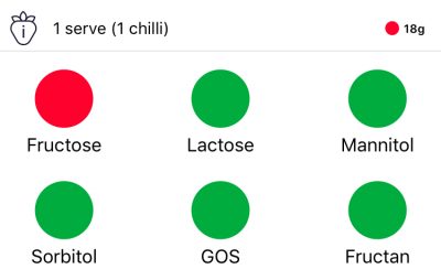
The FODMAP Diet app helps people following the FODMAP stick to their diet, color blind or not.
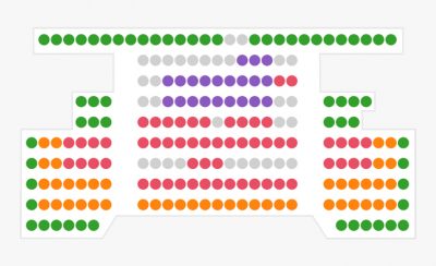
One of UK’s largest ticketing websites is not very usable for the colorblind because they use color-coded elements to inform you about price and availability
Trello added a colorblind friendly mode to help you to stay organized, even if you’re color blind.
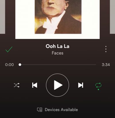
Spotify uses a small dot to show the state of the repeat and shuffle settings, an big help to the colorblind.
Diamond Diaries Saga uses different colors and shapes but fails to be accessible to the colorblind.
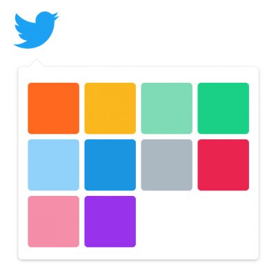
One of the more difficult tasks a colorblind person can encounter is naming color paired with making color combinations. Twitter requires such a thing.
Visual Website Optimizer provides some very good features that make their line charts very accesible for the colorblind.
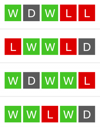
The BBC online football section uses colored status icons to display the results of the last matches. The red and green used to be indistinguishable from each other, but not anymore!
Readability wants you to read comfortably— anytime, anywhere. But what if you’re colorblind?
Wordfeud features good use of color for the colorblind.
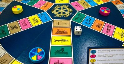
Bad color combinations and confusing usage of color make Trivial Pursuit a nightmare for the colorblind.
Trainyard is a good example of how a puzzle game can implement a colorblind-mode to make the game playable for the color blind.
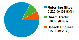
Pie charts are used throughout Google Analytics in various reports to provide a quick way of checking metrics like visitor sources.
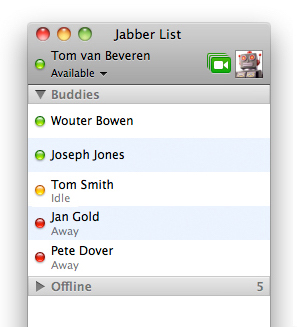
iChat comes with every Mac and can be used for different chat services. iChat uses color coded icons to define different user states.
Let us know if you have ideas for new examples!