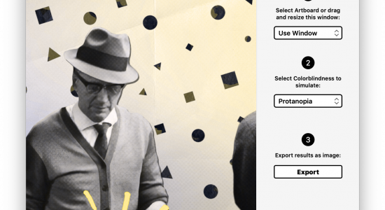
Readability wants you to read comfortably— anytime, anywhere. But what if you’re colorblind?
Readability offers you a clean reading experience by stripping webpages from any distracting elements like ads, sidebars and navigation. You can convert any webpage into a Readability version and read it in your browser on a laptop or desktop. They also offer iOS and Android apps to take your articles with you.
Articles are stripped of any markup and converted into a consistent clean design. In this design the text-links are red without an underline. This poses a problem for the colorblind, especially the protan- (red) types of colorblindness.
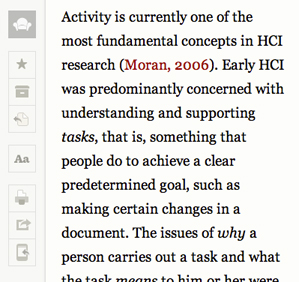
They have difficulty distinguishing between the black of the main text and the red of the text-links. This results in the colorblind having trouble spotting a text-link in a body of text. The protan- (green) type colorblind have the same trouble, though somewhat less serious.
There are websites that do not include the default underline on text-links. This is often not a problem as long as a good contrasting color is used, the contrast between the links in readability and the text is not big enough though.
The desktop version of the Readability reader view does offer a underline on hovering over a text-link, the colorblind can use this functionality to quickly recognize a link if they are hovering over it.
I say if, because even if it does add some clarity and reassurance that you’re indeed dealing with a text-link it still does not address the problem of finding and recognizing links in a body of text. As a result, the colorblind will more than often just not spot a potential link, they’ll just won’t know it’s there.
However, the real problem lies with Readability on mobile devices. Mobile devices like the iPad or a smartphone do not have a mouse, no mouse means no hover function. Spotting a link is still difficult, but confirming that a link is also difficult due to the lack of feedback.
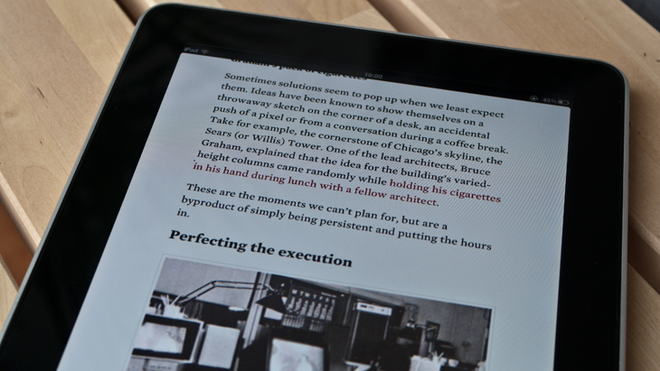
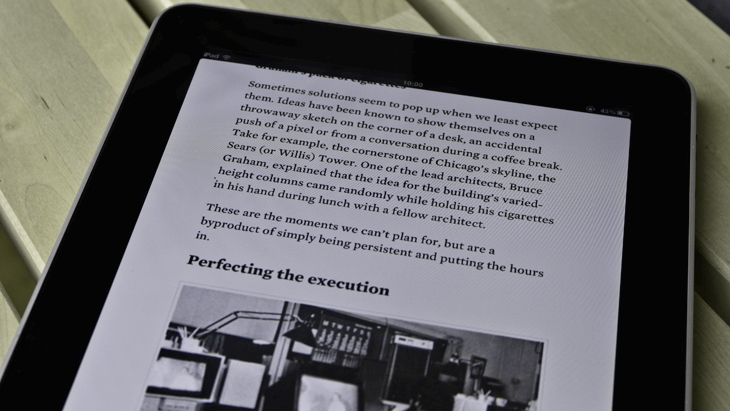
To make matters worse, reading from a mobile device also exposes you to a wider and stronger variety of external influences.
Screens are smaller, saving your battery with a lower brightness reduces the contrast between red and black, the same goes for the reflection of sun- or other bright lights. Even vibrations and noise from the train you’re on tend to also make it harder to focus on the app.
Key here is communicating with information other than color. Solutions lie in increasing contrast (pure bright red: #ff0000 instead of dark red: #9C0001), underlining links or adding an icon next to it like wikipedia does with its external links.
A special colorblind mode might be a last option if changing the design of text-links does not fit within the default style.
Update
The CTO of Readability just messaged @wearecolorblind on Twitter:
@wearecolorblind Thanks for bringing @readability‘s color deficiencies to our attention. I’m talking with the team now about what we can do.— Chris Dary (@chrisdary) June 3, 2012

