Designing with the Colorblind in Mind will improve your Design for Everyone
About 4% of the population has some form of color blindness. One in 12 men and 1 in 200 women are color blind and face challenges with a lot of online products like websites, apps, games, and webshops in their daily life.
Thankfully, designing for the colorblind doesn’t have to be difficult. And best of all, designing with the colorblind in mind will also improve your design for everyone.
How does color blindness work?
To see, we need light to hit the retina at the back of our eyes. The retina is made up of photoreceptors: rods and cones. The rods are sensitive to light while the cones pick up color.
When one type of cones malfunctions, the color this cone would normally absorb is altered. This changes your color perception, resulting in what we call color blindness.
The three types of cones translate into three main types of color blindness: Deuteran (green), Protan (red), and Tritan (blue).
What do the colorblind see?
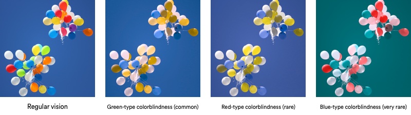
First of all, the colorblind do see color. Green is still green and red stays red, but not as vibrant or bright as someone who’s not color blind would see it.
For the colorblind, colors lie closer to each other and tend to blend together more.
Because of their reduced color perception, the colorblind face challenges with a lot of online products like websites, apps, games, and webshops. You can find examples of these challenges on . You can also read more about the details of color blindness in our quick introduction to color blindness article.
Designing for the colorblind
There’s a big difference between not being able to distinguish between two colors and not being able to use an interface because you can’t distinguish between two colors. The difference is design, someone designed the interface to rely on color alone.
As designers, we should take into account that there are many people that don’t see the way most people do. Thankfully, designing for the colorblind doesn’t have to be difficult. There are a couple of simple principles you can use to make your design much more accessible.
Two simple rules about contrast and color
First, good contrast helps a lot. The more contrast, the better the colorblind can see the difference between the two items.
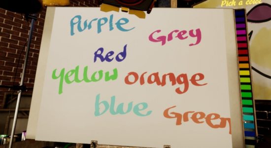
Second, never use color alone to convey information or indicate action. Always provide alternatives in the form of text, icons, or other indicators.
These two simple rules should be easy to follow and will greatly benefit the more than 300 million colorblind people out there.
You can read more on color accessibility in the guide to color accessibility in product design by Justin Reyna. Or more generally on accessibility in the designing for accessibility is not that hard article.
Designing for the colorblind will reward everyone
Including the colorblind into your process is great, but as designers, we should take into account that there are many more people that don’t see or interact the way most people do.
A good design is inclusive and works for everyone in every situation. And right now, there are many different situations.
We are no longer just using our websites from behind a desk, with the curtains drawn, reading from a big, well-lit screen. We use phones and tablets outside of these rooms with perfect conditions.
People walk around, navigating on their phone with sunlight reflecting on their screen. On a moving train, we try to keep the focus on the finger-smudged screens of our shaking tablets. Or be in a hurry to text someone back with just 2% battery left.
And then there’s those with cracks in their screens–so big, but miraculously still working.Good design principles make sure a website or app can be used for everyone in all situations.
The simple dot that makes the Spotify app more inclusive
The Spotify app is a very good example of a small design addition that made the app more usable and accessible to everyone.
Users listening to music with Spotify on their phone, tablet or computer can put their music on repeat or shuffle with two buttons. These buttons act as toggle buttons, the buttons are white in the inactive state and turn green when activated.
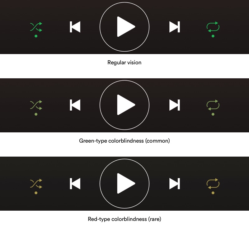
For the colorblind, there are a couple of issues with these buttons:
- Most color-blind users have trouble with the color green
- It’s more difficult to see the color of small items than bigger items
- The contrast between the green button and the dark background is OK, but could be better.
Combined, these issues would make it really challenging for a color blind person to see if their music is on shuffle, repeat, or both. Luckily, Spotify added a something really nice: a simple dot.
When a button is active, a small green dot is shown below the button. When a button is not active, the dot isn’t there. It might be a small dot, but it provides the colorblind with something other than just color to interact with. Because of the dot, it’s no longer necessary to be able to see the green, know the color is green, or see the difference between the white and green.
The dot is a simple but great feature that doesn’t change the way the app looks or confuse users that are not color blind. And the best thing about the dot? It helps not just the colorblind.
Anyone using the Spotify app might encounter external influences like sunlight, low brightness, or shaking. The dot puts extra emphasis on the state of the button, whether or not you’re color blind.

It could be the difference between having to listen to having to listen to S Club 7’s “Bring it all back” on repeat for hours or also enjoying the rest of your playlist.
This article was originally written for and published at invisionapp.com.