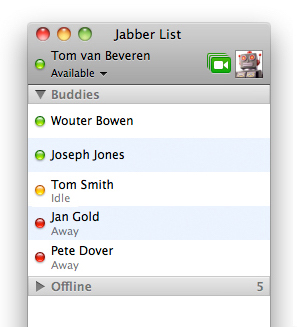
iChat comes with every Mac and can be used for chat services like MobileMe, AIM and Google Talk. iChat uses color coded icons to define different user states.
There are three different states for a user: online, idle and away/busy. Away and busy share the same color and icon and will be considered the same in this example.
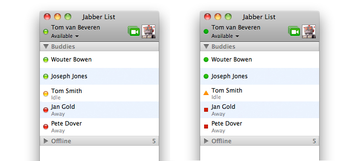
The different states are indicated by colored icons in the shape of circles. Light green for online, yellow for idle and red for busy. The title of the status is displayed below the name when a user has not entered a custom status.
iChat offers a ‘User shapes to indicate status’ option. This changes the shapes and the colors of the icons into a dark green circle, darkish yellow triangle and a dark red square.
As a general rule, to be usable by the color blind a set of icons should communicate with more data than just color. By adding shapes, this option does a good job addressing any problems the color blind could have with recognizing the colors for the identically shaped status icons.
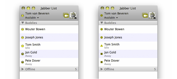
Interestingly enough though, the colors now lie closer to each other. The darker green of the available and the red of the busy status are very close to each other. It is now quite difficult to differentiate between the red and green for the colorblind. The yellow of the idle status might also look light green in some cases.
Now, its quite clear who has what status in a situation with all states present. There are some constants that can be used to interpret the information. First, both people idle and away have their status written under their name. Second, contacts get sorted based on their status; online at the top, followed by idle and busy at the bottom. Finally, the triangle and square icons communicate their meaning with their shape.
However, not all situations provide enough information to fully understand the way iChat handles color and shapes. This mostly applies to new users.
The contact list will only show green circles when no one is idle or busy. A new user has no way of knowing what kind of icons or colors are used for other possible user states. There could be green and red icons, but there is no way of knowing.
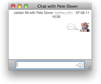
A list of multiple people with the away or busy status who have all set a custom message could also prove difficult for the same reasons as above. To make matters worse, the status of a user cant be found on a individual chat screen. There now is no way of knowing the status of a user.
These problems could be solved by making the user status present at all times. Possibly after the name of the person or in front of the custom user message.
Thankfully these situations are rare enough to not be that much of a serious problem. However, these problems are present, thus making the solution not an optimal one. I’m still marking this example as a good example as the solution is at it’s base a good one. It only needs some tweaks to make it perfect.