Google Analytics is a free website statistics service by Google that generates detailed stats about the visitors to a website.
Analytics displays data in several different ways like detailed line charts, inline sparklines, data grids, bar charts and pie charts. Each is used for different sets of data in different situations.
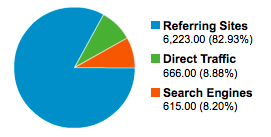
Pie charts are used throughout Google Analytics in various reports to provide a quick way of checking metrics like visitor sources. They can also be enabled as an alternative way of displaying most data grids.

The red and green used in these charts bring together two mayor problems for the colorblind: the telling apart and matching of colors between the chart and the legend.
Telling apart the red and green in the legend is very difficult, the colored squares are too small, making it really difficult to recognize and name the red and green there.
It’s impossible to match the colors of the legend to the colors of the chart. This makes matching the colors of the legend to the chart very difficult, almost impossible even.
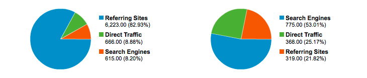
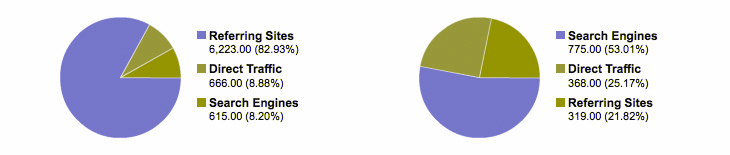
Thankfully the legend itself contains enough basic information needed to understand the data. It sometimes is even possible to match the legend to the chart when the red and green labeled percentages have sufficiently different values.
However, this completely forgoes the goal of the piechart. Pie charts are used to illustrate proportional relationships, ideally at a quick glance. As a colorblind, having to use the legend then is inefficient and far from ideal.
There are multiple easy fixes available. For example: A label with the name and percentage on mouse-over or next to a part. Same rule as always: don’t rely on color alone to communicate something.
Truth to be told, most colorblind just skip pie charts whenever they encounter one. Charts are a very common and frustrating problem for the colorblind. It’s very rare for one to be accessible. It takes too much effort to figure them out, making skipping them the most efficient option.
The thing that amazes me most is that this is a heavy used product by none other than Google, used by millions of websites and users. It shows that everyone, big and small, makes these mistakes. It would have been nice if Google would have been the exception to this rule.