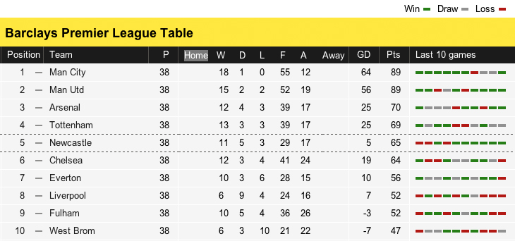
The BBC used to use colored status icons that were not usable for the colorblind. Since then, the tables have been updated to be more accessible to the colorblind.
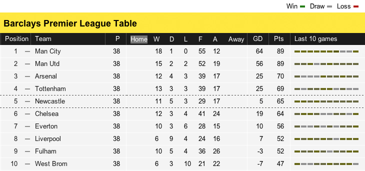
The BBC online sports section covers the match results for several leagues & cups. These results are presented in a table that lists the current standing of each team.
Among the matches played and the points earned, the table shows how many matches in total were won, drawn, and lost. A quick recap of the last 5 match results for each team are also displayed as status icons.
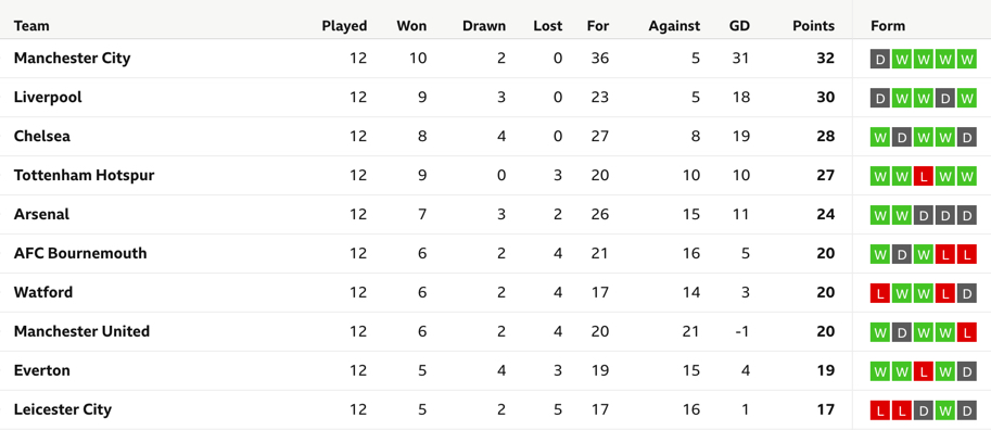
This is a very useful feature, it adds value to the table by giving you a quick insight into the history of that team. It tells the story of how they got to the position they’re in right now, while also acting as a reminder of the matches you might have watched.
In 2012, these tables used colored status icons to display the results of football matches. Only red and green were used and were are indistinguishable from each other, making that part of the table not usable by the colorblind.
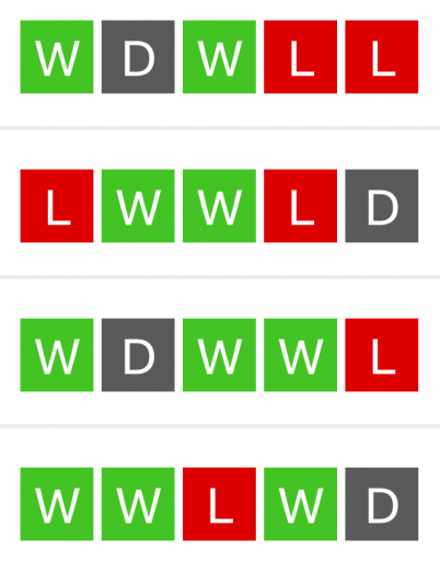
Since then, the BBC has updated these tables to be more accessible. The last 5 match results are still displayed as status icons, but increased in size and now also display an explaining character: a green W for a win, a red L for a loss, and a grey D for matches that ended in a draw.
This is a simple but huge improvement from the way the table was displayed before.

Contrast
The contrast between the red and green in increased. From the old 1.34 ratio which failed all standards to a little better ratio of 2.14. This still doesn’t validate the standards for good contrast, but at least it’s an improvement from before.
Size
The icons are bigger. From the very small 11 by 4 pixels to a bigger 36 by 36 pixels. It’s easier for the colorblind to tell the difference between two colors the bigger those colors are.
Information
Before, the only information you could use was color. The addition of the W, L, and D characters allow users to use two points of information to understand the icons. The colorblind no longer have to use just color.