New Map Scale is More Readable by People Who Are Color Blind
Published on 10 August 2018
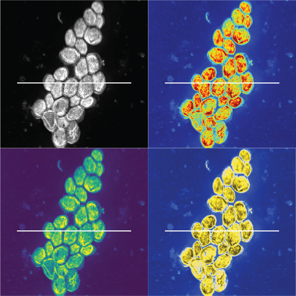
Scientists at a U.S. Department of Energy laboratory have developed a color scale that is mathematically optimized to be accurate for both color blind people and those with normal vision.
The scale was described Wednesday in a new study in PLOS ONE. “People like to use rainbow because it catches the eye,” says lead author Jamie Nuñez, a chemical and biological data analyst at the Pacific Northwest National Laboratory (PNNL). “But once the eye actually gets there and people are trying to figure out what’s actually going on inside of the image, that’s kind of where it falls apart.”
Read the whole article at The Scientific American