With Trello you can create boards to organize things you’re working on. Whether it’s managing a team, writing a screenplay, or making a grocery list, Trello wants to help you to stay organized.
On a board you can create lists and cards. Cards can be added to and moved between lists, allowing users to do things like categorization cards or setting up workflows.

The default colors are bright and vivid, which is great. However, the colorblind usually have difficulties telling apart and recognizing small colored items.
In the case of Trello, it could be difficult for a color blind user to tell the label(s) that belong to a card, or which cards have the same label(s). You could also mislabel a card or simply miss a card having a certain label you’re looking for.
The important thing here is that Trello is a productivity tool, meant to help you speed up your work and get things done. You don’t don’t want make mistakes or get confused because you’re trying to figure out what label a card belongs to.
Luckily, Trello added a very good feature for the colorblind.
Colorblind Friendly mode

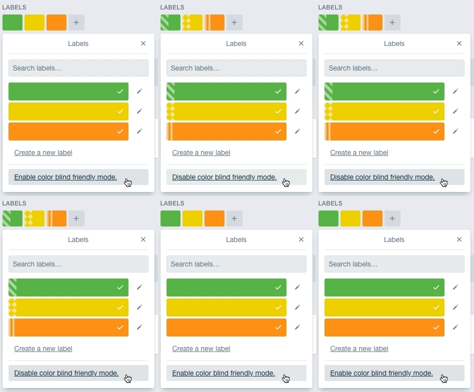
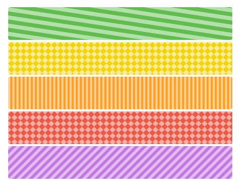
Introduced in 2014, the Colorblind Friendly mode adds a simple textured overlay to the colored labels everywhere they’re shown.
The labels keep their color, the textures are added on top of the labels itself.
The colorblind friendly mode can be turned on or off from the user-settings page or simply when selecting a label. It’s very easy to discover and when enabled does not get in the way of users that aren’t color blind.

The colorblind friendly mode is a very good example of a simple feature that helps the colorblind a really great deal. It’s simple and lightweight, but very effective, without impacting the overall look and feel of the product.


