ATG Tickets is the UK’s largest ticketing operation for the arts and entertainment industry. The self described most celebrated theatre ticketing website is used by numerous big name theatres and venues and sells tickets for high profile productions.
The system uses several different interfaces, but in this example we’ll focus on the one with the biggest issues.
Below is a simulation of how a color blind person would experience finding, selecting, and buying tickets for ‘Caroline, or Change’.
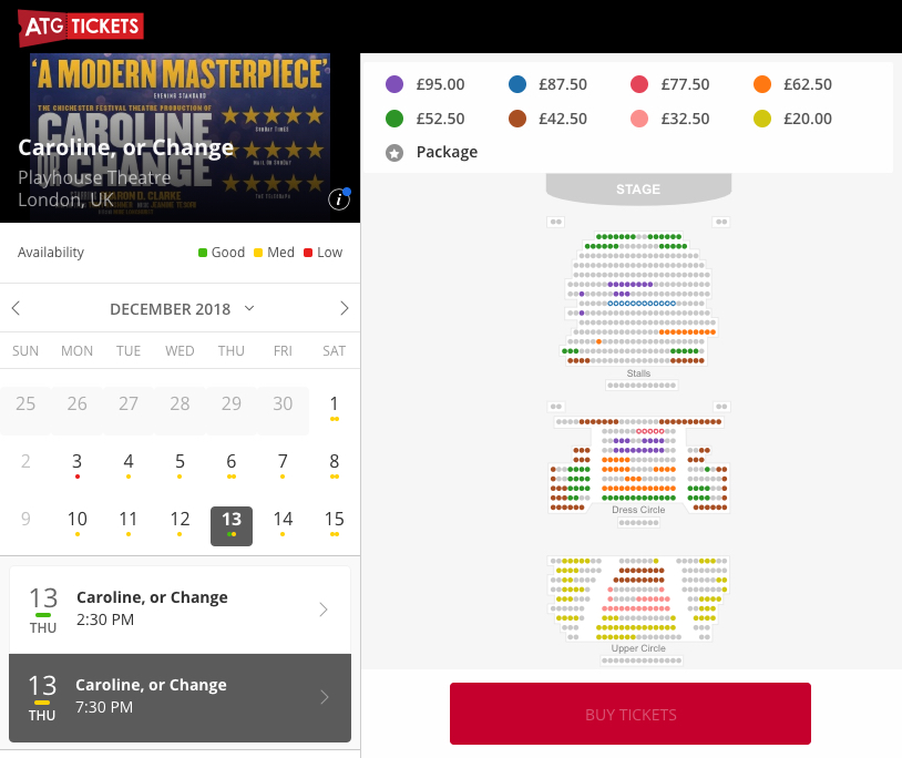
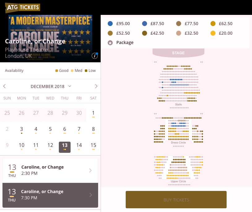
There are several different issues for the colorblind with this interface.
A Dissection of Interface Elements
The ticket buying interface relies heavily on color. These colors are used as the sole source of information for availability and price of seats.
This results in several issues, mainly because:
- Most of the colorblind have trouble with recognizing and telling apart the colors green, red, and orange
- It’s more difficult to see the color of small items than that of bigger items
- Colors are harder to compare to each other the further away they are
Ticket Availability
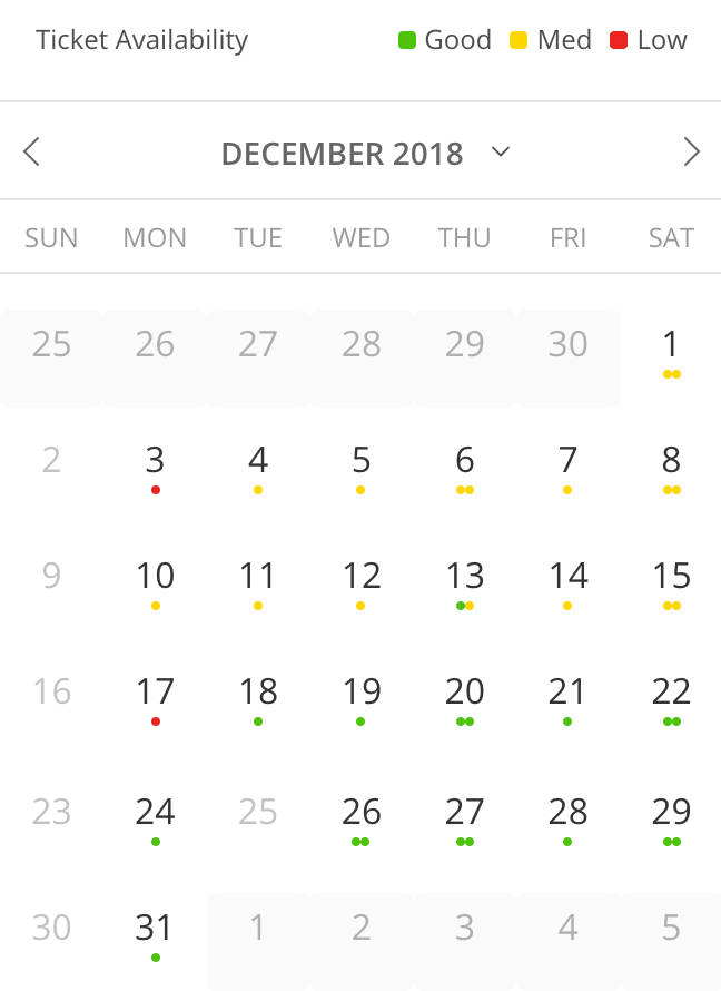
Buying a ticket, you are first required to select a day from the calendar. Tickets are not always available on every day, either because the show does not run that day, or the show might be sold out.
The availability is indicated per date using small color-coded dots. The legend explaining these dots is shown above the calendar.
The dots are very, very small. This makes it very hard to tell apart the green for good availability and red for low availability. It also makes it hard to match the dots to the legend above the calendar.
This makes it difficult for the colorblind to get a quick idea of how available the tickets are. A color blind user has to click each individual date to check the availability. The amount of work involved might be discouraging and keep users from checking more than a couple of dates.
Seat Selection
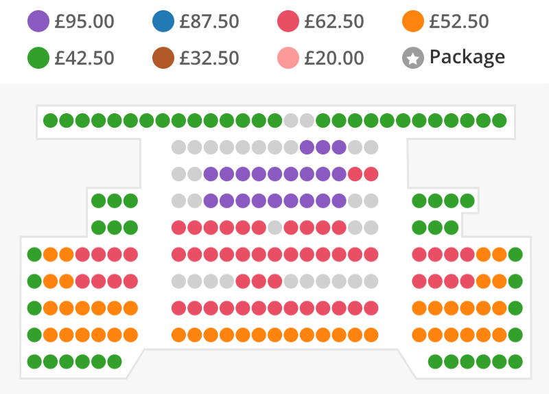
After selecting a date, the seat selection map opens.
Here you can select one or more seats at the location of your choice. The better the seat, the more expensive they are.
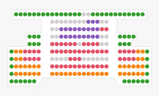
The map is made up of seats, the color refers to the price of that seat. The the prices are shown as a legend above the map.
In this particular case, there are seven colors present. Several of these colors look almost identical to each other for the colorblind. To make matters worse, both the legend and the seats are very small, making it even harder to recognize and differentiate the colors used.
Again, this part of the ticket buying process is challenging and potentially frustrating.
Seat filtering
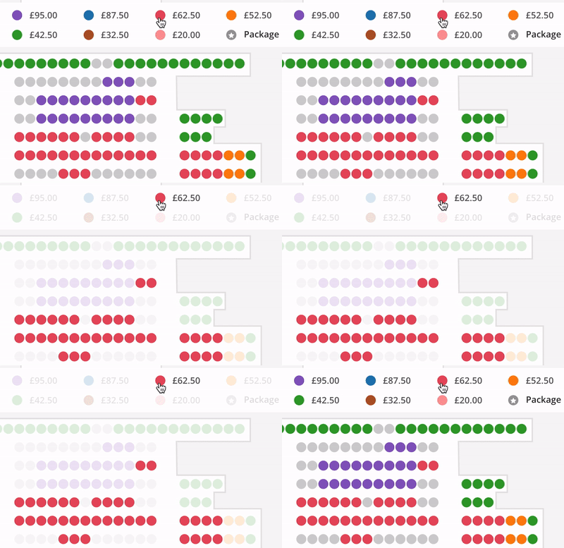
On a more positive note, one very useful feature is the seat filtering option.
Users can click a price in the legend, this will highlight all seats within this price-category.
This is a great help for the colorblind. Color is no longer the main source of information as you can use it to make a direct link between the pricing legend and the seats.
In conclusion
Overall, the colorblind should be able to successfully buy a ticket. However, it will most likely be a challenging and frustrating process.
Especially frustrating because the colors, dots, and legend are always visible, reminding the colorblind of the fact that the easy way of interacting with the website is there, but just not for them.
