Visual Website Optimizer provides some very good features that make their line charts very accesible for the colorblind.
Visual Website Optimizer is a webbased testing tool used by people (UX, marketing, etc.) wanting to improve their website. It’s used to run split tests on webpages, testing one version to one or multiple other versions. It’s a data driven analytical tool that uses visitor numbers and conversion numbers to calculate the best version of webpage or element.
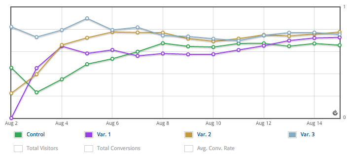
Results are a very important part of the tool, users will mostly be found in the reports section of the admin interface, quickly checking numbers and looking at graphs. One of those graphs is the goals line chart. This chart gives insight in the conversion rate (number of visitors compared to how many of them bought something) for each version of a page. This is an important part of the test as it shows you what the best version is.
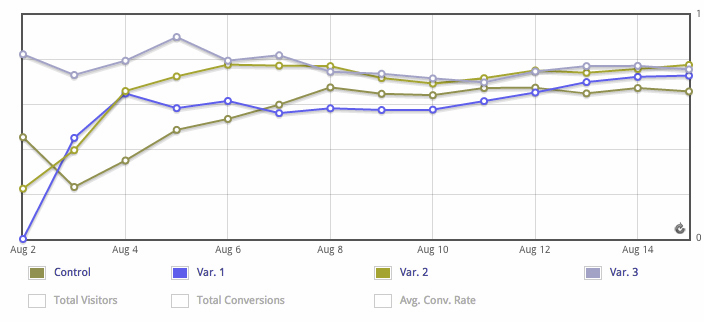
The chart itself is your basic analytical line chart: different value’s are compared to each other over time. It uses different colors and a legend to match the lines to the variations. The colors are not actually that bad, in the situation below the 4 colors are somewhat distinguable from each other. Though when multiple lines are really close to each other or other metrics are present it get’s difficult or impossible to read the chart.
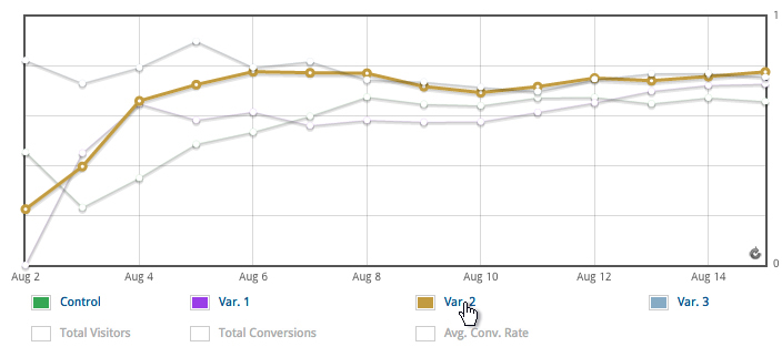
Thankfully there are multiple ways of reading the chart without using color alone. The most useful way is to hover over the name of the variant in the legend. This removes all other colors, making it very clear what line corresponds to what label. It’s a great way of making an important chart like this very usable to the colorblind in a quick and reliable way.
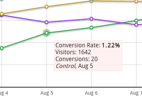
An alternative is to hover over the dots in the chart itself. This shows you a little tooltip with extended data and the name of that line.
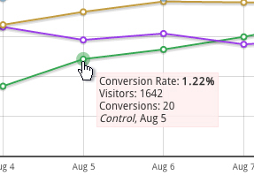
The tooltip is a nice addon, though on it’s own it wouldn’t have been enough. This has to do with learnability, in the chart above the lines are far from each other on the left but the lines are closer to each other on the right, making it very difficult to trace a line you’ve identified on the left.
All in all there are multiple ways of making the chart usable for the colorblind. This is a really good example of how an important chart can be accesible in a non intrusive way without giving up the use of color or design of a website.